Creating the Graphic Part of iRidium Projects
Contents
- 1 New iRidium Projects
- 2 Graphic Items
- 3 Project Pages and Popup Pages
- 4 Macro Сommands (Macros Editor)
- 5 Processing Pressings and Gestures
- 6 Graphic and Sound Galleries
- 7 Working with Images
- 8 Dynamic Images
- 9 Creating Visualization Effects
- 10 Optimization of the Project Graphic Part
- 11 Merging iRidium Projects
Each iRidium projects consists of the graphic part (pages, popups, buttons, images, animation, video-stream and control items) and the driver part (commands and equipment status channels, scripts on the basis of iRidium DDK). These parts communicate and define the project work scenarios by their settings. Creation of iRidium projects begins with setting up of their graphic parts.
The graphic part of the project (design) can be received in one of the following ways:
- Download a ready Sample GUI from the "Downloads" section of the iRidium mobile web site - iridiummobile.net. It will allow you to save time and not to create a GUI from scratch.
- Buy a Sample GUI in the BUY section of the iRidium mobile web site - iridiummobile.net (for integrators only). In order to do that you are required to go through the procedure of Full Registration in the My account section.
- Create a GUI in iRidium GUI Editor.
New iRidium Projects
After opening iRidium GUI Editor the first thing you do is creating a new project or opening the ready project. A new project can be created with the help of the button on Tool Box, Ctrl+N or through the menu File > New Project

Settings of the new project:

|
1. Project Name - the name of the new project |

|
2. Size and orientation of the new project:
|
 |
3. Settings of the first page:
|
Graphic Items
Graphic items – interface objects located on iRidium project pages or popups. They are buttons, levels, icons, design items, background and animated images, other specific types of items.
After creating a new iRidium project you will see the start page where you can start work with graphic items.
Creating Graphic Items (Draw Item)
Use the Draw Item tool in Tool Box to create a template of a graphic item. On the basis if the template you can set up any item with any properties:

The item template has 2 states (on/off) and the Button type by default. Such Button will change its state to the opposite at pressing and return to the initial state at releasing the graphic item.
States of graphic items
To create or delete a graphic item state (State) and go from one state to the other faster use the tools (Object Properties > States):

|
Current State - the current selected state of the graphic item |
|
Prev State - open the previous state |
|
Next State - open the next state |
|
Add State - add one more state to the selected |
|
Delete State - delete the selected state |
General Properties of Graphic Items
There are several types of graphic items you can use for programming behavior of interface items and their communication with controlled equipment.
Select the item type in Object Properties:

Set up the item properties. They depend on its type:
| General Type, position and size of the item in the workspace |
Programming Setting up connection with equipment, navigation commands, etc. |
States Item appearance: color, images, text, etc. |

|

|

|
General
General properties of interface objects of all iRidium items by the example of Button:
- Name – the graphic item name, set at random
- Left / Top – item position on the page (left and top indent in pixels)
- Width / Height – height and width of the graphic item in pixels
- Active – item activity (reaction on events)
- True – the item is active (sends commands, receives data)
- False – the item is inactive: it is blocked for pressings and does not send commands (the inactive item becomes black and white when working with the client, this tag can be affected while the project is working on the control panel)
- Visible – item visibility when launching the project on the control panel **True – the item is visible
- False – the item is invisible (the tag can be affected while working with the project with the help of scripts or the Relations events)
Specifics – unique item properties defined by its type:
- Type – the graphic item type. It is selected depending on the required item behavior.
- Feedback – the way the item displays data received from the equipment
- None – user’s pressings do not affect neither the item state nor events in the system
- Momentary – data received from the equipment do not affect the item state. The item changes its state to the opposite one at pressing.
- Channel – the item state is defined by data received from the equipment. Any data can be sent by the sending event but the item will change its state only when it receives the corresponding non-zero value from the equipment.
- Invert Channel – when receiving the zero value from the equipment the item changes its state to active, when receiving a non-zero value it takes the inactive state. There is no reaction on user’s pressings (works similarly to Channel)
- On and Blink – special types of feedback used for work with Multistate Button (see description of Multistate Button).
- Hit (for Button) – the way of processing pressings on the graphic item
- Active touch – to fixate pressings on any non-transparent area of the item (in current version it works similarly to Bounding Box).
- Bounding Box – to fixate pressings on any area of the item, including non-transparent
- Pass Through – not to fixate pressings on the item at all. The pressings will pass through and can be fixated on the item which is under the current one.
- Hit (for Level) – the way of processing pressings on the graphic item
- Active – to process all pressings on the item
- Display Only – not to process any pressings on the item. The item only displays data received from the controlled equipment.
- Active Centering - to fixate single pressings. The slider returns to the center of the scale after its releasing.
- Drag – not to fixate single pressings. The scale position changes only when dragging the slider from the current position to the required one.
- Drag Centering – the scale position changes only when dragging the slider. The slider always moves from the scale center and returns to the center when releasing it.
- Password Number – the number of the password which will be required when pressing on the graphic item. If the password is entered correctly all actions assigned to the item (going to the protected page, sending commands to equipment, etc.) will be performed. Passwords are set in the settings of iRidium App on control panels or in the project settings in iRidium Transfer.
Programming
Settings for communication between graphic items and controlled equipment are similar for all interface items used by iRidium:
Relations, Press, Release, Hold, Move – the interface events. By activating these events you can send commands and display feedback. Command creation is performed by dragging them from and Project Device Panel in the Macros editor:
- Relations – displays relations of the item with channels of drivers and other interface items
- Press – the list of commands to be activated when pressing on the graphic item
- Release – the list of commands to be activated when releasing the graphic item
- Hold – the list of commands to be activated in cycle when holding the item
- Move – it is used for Level and Multistate Level. It receives and sends to the equipment all intermediate positions taken by Level when moving the slider. It is used for gradual regulation. To substitute Move , use Press+Release.
Ways of processing pressings and gestures for graphic items, pages and popups
States
Appearance of graphic items is set up in the States tab. Here you can set up properties similar for all states and unique properties of each state:

All States – properties which define the appearance of all states of the graphic item;
State 1…n – properties unique for each state.
- Color – the color of the image filling
- Color Alpha Channel – the degree of opacity of the item background
- Opacity – the degree of opacity of the whole item
- Text – the field for inputting text on the item
Text Settings:
- Font – a font used for inputting text on the item. Requirements to specific fonts (Arabic, hieroglyphic symbols) besides the recommendation to use Arial Unicode MS:
- 1. Font format: ТТF (ТТС is not supported)
- 2. Font should include all necessary hieroglyphs or symbols
- 3. Font should support Unicode
- Text Color – the color of the text on the item
- Text Align – the way of aligning the text relatively to the item sides
- Text Effect – text effects (select from the list) and color of the effects
- Word Wrap – word wrap when the line is longer than the width of the item
Images and Borders:
- Border – the item border, selected from the list
- Border Color – the color of the border
- Image – the main item image
- Icon – the icon image (placed on top of the main image)
- Image Align – the way of aligning the main image relatively to the item sides
- Icon Align – the way of aligning the icon relatively to the item sides
- Chameleon Image – an image in the PNG format which uses the colors of the filling and the border to define the colors inside the image. In other words it is an image which can change its colors in the process of working with the project.
- Draw Order - an order of displaying item layers (background, image, icon, text, border)
Stretch And Filtration
- Image Stretch – stretching the main image to the item size
- Icon Stretch – stretching the icon to the item size
- Chameleon Stretch – stretching the chameleon image to the item size
- Image Filtration – selecting the way of image filtration at stretching
- Icon Filtration – selecting the way of icon filtration at stretching
- Chameleon Filtration – selecting the way of chameleon image filtration at stretching
To create or delete states of graphic items and move fast from state to state use the tools of the Editor top panel:
To create or delete a graphic item state (State) and go from one state to the other faster use the tools (Object Properties > States):
|
|
Current State - The current selected state of the graphic item |
|
|
Prev State - Open the previous state of the selected graphic item |
|
|
Next State - Open the next state of the selected graphic item item |
|
|
Add State - Add one more state to the selected |
|
|
Delete State - Delete the open state of the selected item |
Types of Graphic Items
You can use the following types of graphic items in iRidium projects:
| Button | Sending fixed values; displaying data received from the controller |
| Level | Sending values from the preset range by the slider; displaying the current value by the position of the slider |
| Trigger Button | Switching between two fixed values indicated at the item setting |
| Up/Down Button | Incrementing/decrementing the current value by the preset value in the preset range. The range and the step of increment/decrement are set at the item setting. |
| Multistate Button | Sending fixed values and receiving data accompanied by animation |
| Multistate Level | Sending and receiving values in the preset range where each value or group of values has its own image |
| Edit Box | Inputting a string of data to be sent to the bus |
| Joystick | Controlling RGB with the help of ColorPicker |
See description of graphic items below:
Button
It is a graphic item with 1 or 2 states. It can be used for sending commands and macro commands to controlled equipment.
Buttons with 1 state can be used as active items, displays and design objects as well as buttons with 2 states.
Button settings:
| General | Programming | States |

Buttons can react to pressings or feedback from the equipment.
Feedback: reaction of Button to pressings or data receipt:
- None - pressings and system events do not affect the Button state (data can be output in the item text field).
Application: display item, text field, non-functional icon
- Momentary – at pressings Button changes its state but does not react to data received from the channel. It is used for visualization of pressings without receiving feedback from the equipment.
- Channel – Button will be change its state when receiving data from the equipment. This type is required for buttons with the assigned feedback channel. State 1 = False, State 2 = True.
”Templates of processing and outputting data” are used to output numeric values on Button. The templates are input in the text field of the graphic item with other text. The Feedback channel with the "In Value" tag will substitute the template with the value received from the equipment:
Template |
Function |
Template |
Function |
$P |
Output of the current level value in percentage | $V |
Output of the current value |
$L |
Output of the lower level value | $H |
Output of the upper level value |
$S |
Output of the current state number | $A |
Output of the current value minus the lower level value |
$R |
Output of the level range (Upper level value minus lower level value) | $F1-5 |
Output of the value with a floating point, number of symbols after a point |
$X |
Output of the current value in the hex type | $$ |
Output of the "dollar" symbol |
A command (template) of incoming data processing and displaying is entered into the text field of a graphic item and can be combined with other text or symbols (comments, units of measurement)
Level
It is a graphic item used for setting and displaying values in the preset range. The setting is performed by moving the slider. Level has 2 states – filled and empty which substitute each other depending on the taken value.
Level settings:
| General | Programming | States |

Feedback: reaction to pressings and data receipt:
- Momentary – Level will send the value at pressing (depending on the slider position) but the slider will not move when receiving data from the controlled equipment:
- Channel – the value is set by the user but the final position of the slider depends on the data received from the controlled equipment
- Invert Channel – the data received from the equipment will be inverted when setting up the position of the slider (minus changes to plus)
Min / Max – the regulation range (minimum and maximum values of the Level scale)
Range Type – the data type of the preset range
- Integer – whole numbers
- Float – numbers with floating point
Direction – Level orientation on the page
- Vertical
- Horizontal
Focus Lock Receive – protection from overload when moving the Level slider for a long time
Invert – visual inversion of the filled and empty Level states
Slider / Slider Color – selection of a slider image on the border between the Level states, selection of color for the slider.
When working with Levels ”templates of processing and outputting data” can be used.
Multistate Button
It is a graphic item used for displaying animation at pressing, receiving data or all the time. It sends commands like a standard Button. Only the appearance of the item is different. Animation can be performed in cycles and can be used for creating items of project design.
Multistate Button settings:
| General | Programming | States |

Feedback: defines how animation work
- Momentary – animation will be played when pressing on the item. When the item is released the item will returns to the initial state. If it’s Repeat: True, then animation will not stop until the item is released.
- On – animation will start to play when launching the project, from the first frame. If it’s Repeat: True then animation will be played all the time when the project is launched (endless cycle).
- Blink – animation will play when receiving any non-zero value (True) from the equipment. If it’s Repeat: True the animation will be played until the zero value (False) is received from the equipment.
Time Up / Time Down (tenths of seconds) – time of presenting animation frames from the first to the last one and back.
Repeat – "cycling" of animation. If it is deactivated animation goes to the last frame and stops. When it is activated animation goes in cycles until the item is active. The activity of the item depends on its feedback type.
Download: MS Button examples (how to use), 1,2 Mb
Multistate Level
It is a graphic item similar to Level but it can show its state for each values of the regulation range Min...Max. Each state of the item corresponds to the part of the regulation range. It enables changing of the item appearance by moving the slider.
Example: in the Level settings you select the range "Min:1 .. Max: 100" - the item has 100 possible values. Then in the States tab of Level create 4 states (State 1 ... State 4). Now when receiving values from 0 to 25, the item will show State 1 (26...50: State 2, 51...75: State 3, 76...100: State 4). Each state can be assigned a unique image, text, etc.
Multistate Level settings:
| General | Programming | States |

Properties of Multistate Level affecting its work:
Feedback: reaction to pressings and data receipt:
- Momentary – Level will send the value at pressing (depending on the slider position) but the slider will not move when receiving data from the controlled equipment:
- Channel – the value is set by the user but the final position of the slider depends on the data received from the controlled equipment
- Invert Channel – the data received from the equipment will be inverted when setting up the position of the slider (minus changes to plus)
Min / Max – the regulation range (minimum and maximum values of the Level scale)
Focus Lock Receive – protection from overload when moving the Level slider for a long time
Invert – visual inversion of the filled and empty Level states
List
It is an inertial list – a dynamically formed scrolling list. It is not set up in the iRidium project but filled in with the help of iRidium Script: List API. Configuration of List and its content are set up with the help of scripts.
This item type is frequently used when working with AV equipment for creating lists of tracks, films, folders, etc.
The number of list items are limited by free memory of control panel.
Up/Down Button
It is a graphic item which performs step-by-step increment or decrement of the current value of the variable. The step and the limits of increment/decrement are set up in the item settings.
- Up Button is formed by setting up positive value of increment (10) and upper increment limit (100).
- Down Button is formed by setting up negative value of decrement (-10) and lower decrement limit (0).
Settings of Up/Down Buttons:

Feedback – reaction to pressings and data receipt:
- Momentary – it is recommended for Up/Down Buttons as it enables the items to change their state at pressing visually without affecting processing of incoming data.
Up/Down Value – the step of increment/decrement. It can be positive (10) and negative (-10)
Max/Min Value – a maximum/minimum value of increment/decrement. For positive increment it is the upper limit, for negative – the lower limit.
 Any item of this type is required to have information about the state of the controlled variable.
In order to do that it should have the feedback channel assigned to it (Feedback of the driver).
 Any item of this type is required to have information about the state of the controlled variable.
In order to do that it should have the feedback channel assigned to it (Feedback of the driver).
Trigger Button
It is a graphic item used for sending one of the 2 preset values (Value 1 and Value 2). When pressing on the item it checks state of the variable and sends the state opposite to the current one.
Trigger Button settings:

Feedback - reaction to pressings and data receipt:
- Channel – to display the current state of the variable and change it with a pressing.
Trigger Value 1 / 2 – the values the item will switch. The values are defined at random depending on the properties of the variable.
 Any item of this type is required to have information about the current state of the controlled variable.
In order to do that it should have the feedback channel assigned to it (Feedback of the driver).
Edit Box
It is a graphic item used for entering data from keyboards (physical or virtual). In order to start the input it is required to press on the graphic item. The input data stay on the item from where they can be moved by clicking Enter or by pressing on the neighboring graphic item.
Edit Box does not have any special settings and preset command. They have to be created manually.
When clicking on Edit Box the keyboard of the control panel (tablet, smart phone, etc.) is usually activated: Object Properties > Programming > Press (событие) > «Show Keyboard [keyboard_type]».
Then the data from the Edit Box text field can be moved to another item or driver:

In the picture you can see the example of the set up and functional Edit Box.
By clicking on Edit Box in the example:
- Press: the virtual keyboard of the smart phone (tablet) opens
- Enter: the Edit Box item sends the input text to the driver as a command, then it closes the keyboard and clears the field.
Sending data from the text field to the driver is set up in the macros editor:

Here you can also set up the command of "clearing" for Edit Box. To remove all data you input ,write an empty string in Edit Box:

When the command is sent to the equipment, Edit box is in the initial state and you can repeat data input at the next pressing.
See variants of Edit Box setting up
Virtual Key
It is a graphic item used for forming user keyboards (digital, alphabetic, system keys). You can create any kind of keyboard with any configuration with the help of Virtual key. There are some specific properties of Virtual key affecting its work:

- Feedback - reaction to pressings способ. Channel – for keys with set up possibility to change the register. Momentary – for keys responsible for inputting a separate symbols
- Key Type – the key type, it defines its behavior
- Normal – the key with 1 state (without changing cases)
- Trigger – the key with 2 states (for example with changing cases or keyboard layout)
- Multistate – the key with several states (the number of states is set at random)
- Key Action – the key event
- Insert Text – inputting the symbol indicated in the graphic item text field (input 1 letter or number in the item text field and the key with the command Insert Text will send it)
- Enter, Up, Down, Left, … – functions of the standard device keyboard (on the basis of Windows OS). You can activate them by selecting the corresponding Key Action for the item.
To switch states of Virtual Key (switching layout or register), it is recommended to use the project variable which will save data about the state the key has to be in. The variable value can be rewritten with the help of project buttons created for specific purposes (buttons for switching layout or register). To switch states of Trigger Buttons or Multistate Buttons, create a variable and set up the state value from 0 to n. The variable has to be assigned to keys using the tag “In Value” to enable change of the item state depending on the variable current state.
Joystick
It is a graphic item used for sending X and Y coordinates of the Joystick cursor. It is also possible to receive the color under the cursor for RGB control. This item type us often used for controlling the RGB palette (see more information in the Working with Equipment section).

- Range Type – a range type. It defines the type of X and Y coordinates:
- Integer – whole numbers
- Float – numbers with floating point
- MinX / MaxX – limits of changing the Joystick cursor position by Х coordinate
- MinY / MaxY – limits of changing the Joystick cursor position by Y coordinate
- InvertX / Invert Y – to invert the values of the Joystick cursor position by X or Y coordinate (for example, for creating negative ranges without inversion of the cursor position)
- Cursor / Cursor Color – the cursor image and its color
Static List
It is a graphic item on which base you can perform scrolling of project popups with the help of gestures.
Static List is a base item. Popups added in the list will be displayed in it. The size of the base item is usually equal to the size of the popups but can be smaller or bigger than it.

Static List settings:
- Direction – Static List orientation: vertical or horizontal
- Resistance (%) – the degree of Static List resistance. It is a value in percentage terms showing how the speed of Static List changes per time unit
- Scroll Bar – show/hide the Static List scroll bar
- Popups List – the list of popups – Static List items
- Pull Up Type – the effect for switching the Static List items
- Pull Up Time (ms) – time of switching the Static List items
- List Type – the way of "sticking" popups to the edges of the base list item. It is required when the size of popups in the list is different from the base.

Example:
Static List with several popups (Popup 1, Popup 2, .., Popup n). The list can be scrolled horizontally in two directions. All items on the popups of the list are fully functional.
Download the example of the project (1.3 Mb)
 Attention! You cannot use the same popup in several Static Lists.
If you want to use the same popup in different Static Lists, you need to clone it the required number of times.
Project Pages and Popup Pages
Each iRidium project has a start page which properties are set when creating a new project. Other pages of the project are created on the basis of this page. You can also create popups which serve as auxiliary objects of the workspace and for placing graphic items.
Creating New Pages and Popup Pages
Projects consist of pages and popups:
- Page - the basic project object for placing graphic items.
- there should be at least one page in the project
- pages can be either vertical or horizontal
- pages support the auto-turn function (horizontal/vertical switch when turning the control panel with the accelerometer). In order to perform the auto-turn function there should be 2 pages with different orientation
- all project pages have the same size. They define the size of the project workspace.
- pages cannot appear with animation effects or be transparent or semi-transparent
- only one project page can be opened at a time (opening of a new page closes the previous page and its popups)
- Popup – an auxiliary object for placing graphic items
- having popups in the project is not obligatory
- popups cannot be horizontal or vertical (its coordinates are fixed)
- popups can have any size, opacity and position on the page
- there can be any number of popups on one page
- at auto-turn of a page the popups which were opened will be closed (they should be activated again when opening the page manually or by auto-turn)
To add new pages and popups in your project use the tools of Project Overview:

Add Page – to add a page
Add Popup Page – to add a popup
Add Folder – to create a folder of pages and popups
Change View – to switch the view of the tree of pages and popups for working with Popup Groups
Settings of new pages and popups:

New page:
- Name – the page name
- Landscape/Portrait – the horizontal/vertical orientation
New popup:
- Name - имя попапа
- Left and Top – the shift of the popup with respect of the left top page corner (in pixels)
- Width and Height – the popup width and height (in pixels)
Landscape/Portrait Page Orientation, Page Settings
When creating a new project you select the orientation of the first page – Landscape or Portrait.
This orientation is not final for the whole project. You can select any orientation when creating new pages.

- Name – the page name
- Alternate View – the page with the opposite orientation page which will be displayed instead of the current one when you turn the control panel with accelerometer
- When creating a design with auto-turn, use Pages, not Popups. It is preferable as at auto-turn of a page all previously opened popups will be closed. It can create problems with prompt demonstration of popups and keeping them opened. To open popups at auto-turn, use iRidium Script API
Preliminary View of Popups on Pages
For convenience of popup positioning you can use the tool of preliminary view:
- To see how a popup will look on the selected page
- To see how a selected popup will look if you select a page for its background

The tool is available in the right click menu on the open project page or popup.
Switching Between Pages and Popups
For switching, opening, closing project pages and popups there is a group of navigation commands which are performed when particular system events are activated:
- Pressings on graphic items
- Gestures on pages/popups
Navigation commands are formed in the window for creation macros for pages, popups and graphic items. They can be different for different events.

Navigation events used for working with project pages, popups and groups of popups:
| Flip (commands for switching pages) | |
| Show Page (Page name) | Open the page (only one page can be opened at a time). Indicate the name of the page you want to open in the command properties. |
| Prev Page | Show the project page which was opened previously. |
| Show Popup (Popup name) | Show the popup (a number of popups can be opened at a time). Indicate the name of the popup you want to open in the command properties. |
| Hide Popup (Popup name) | Hide the popup. Indicate the name of the popup you want to hide in the command properties. |
| Toggle Popup (Popup name) | Toggle the popup (show if it is hidden or hide if it is shown). Indicate the name of the popup you want to toggle in the command properties. |
| Hide Group (Group name) | Hide all popups in Popup Group (see below). |
| Hide Popups On Page (Page name) | Hide all popups on the page. Indicate the name of the page in the command properties. |
| Hide All Popups | Hide all popups opened in the project. |
Usually commands of switching between pages or popups are assigned to graphic items (Buttons). Collectively all items with navigation commands form a navigation system of iRidium project pages and popups.
Besides using graphic items for performing navigation commands you can use gestures on project pages. In order to do that select the page from which you will go to other pages or popups in the Projects Overview and then set up the navigation in the menu Object Properties – Programming – Gesture.
Effects of Opening/Closing Popups
You can indicate the effect which will be used when a popup is opening or closing in the popup settings (Object Properties > General).
You can set up one or several different effects for popup opening or closing.

- Lifetime (ms) – popup lifetime. After this time the popup will be automatically closed.
- Effects – setting up effects of showing and closing the popup. You can use a combination of effects.
- Fade – the popup changes the level of its opacity
- Rotate – the popup moves rotating around the main axes
- Slide – the popup slides from the side of the screen or "from itself"
- Scale – the popup increases or decreases its Х and Y coordinates from 0 to the preset one
- TV Scan – the popup appears after changing the Y coordinate from 0 to the preset one
Main properties of effects:
- Duration (ms) – the duration of performing an effect
- Delay (ms) – the delay before the activation of the effect
- Tween – the direction the popup moves when opening or closing
Popup Group - Grouping Mutex Popups
In the regular mod of Projects Overview work you can create "Folders" for grouping pages and popups. It does not affect the project work.
Using the switch in the upper right corner of the Projects Overview panel you can go to the alternative project view where pages and popups are stored separately and you can create Popup Groups:

Popup Group is an alternative way of grouping project popups.
All popups in one group are mutex. It means only one popup from the groups can be shown at a time – if you open one popup then another, the first popup will be automatically closed.
You can hide popup groups with the help of the Hide Group in the editor of maсro commands:

Start Page
When launching an iRidium project on your control panel only one (any) page and an unlimited number of popups can be shown.
To select the page and popups go to the menu of project settings - Project Properties:

Select the StartUp tab in the project settings:

StartUp:
- Page – the name of the page to be opened at the iRidium project launch (only one);
- Popups – a list of popups to be opened at the project launch over the start page. Popups will be opened one by one, in the preset sequence.
Project Screensaver
Setting up of the screensaver in an iRidium project has 3 steps:
1. Create the page which will be used as the screensaver
It is necessary to create a page or select the one which was created before to be used as the screensaver.
2. Set up the screensaver:
2.1 If there are no other control items on the page:
Go to the Programming tab of the selected page and select the "Prev Page" marco for the Press event.

2.2 If there are control items on the page you need to:
- Create Button on the page which has the same size as the page (for example, if the resolution of the project is 800х600, the size of Button should also be 800х600). It should cover the screensaver page;
- Select the created item -> right-click ->select Make BG Color Transparent – and the item will become transparent;
- Assign the event when pressing on the item. In order to do this go to the Programming tab of the selected item and select the "Prev Page" macro for Press event).

3. Select the configured page as the screensaver in the settings of iRidium project. In order to do that go to the menu of project settings - Project Properties:
Select the ScreenSaver in the project settings:

ScreenSaver:
- On/Off – turn on/off the project screensaver
- Page – the page to be used as the screensaver
- Interval (s) – project idle time after which the screensaver will be opened
Download the project:
Examples of screensaver pages >> Examples of screensaver pages by JaHeLi media >>
Password for Opening Pages (Popups)
To create protected pages in the project which can be accessed using passwords you can use the iRidium password system.
Password: None, 1, 2, 3 or 4 – it is assigned to the graphic item by pressing on which the protected page opens.
- None – no password, free access (by default)
- 1 … 4 – the password number which defines different classes of access

The passwords are assigned not in the project but in iRidium Transfer where the project for uploading on control panels is stored:

It is possible to change passwords only in iRidium Transfer. The password will be requested by the application when pressing on the protected button. All commands will be performed only when the correct password is input.
The alternative way of creating a protected page is to use iRidium Script API, see the example here:
Creating the window for password input using scripts
Scaling of Pages and Items
To change the project resolution, for example make the 1024x768 project from the 2048х1536 project, write the required resolution in the project properties. At that, it is recommended to make projects of lower resolution from high resolution projects to avoid problems with graphics quality.

After saving the project in the new resolution you will see two dialog windows:
1. Confirm scaling

- "Ok" – to confirm changes of the project size
- "Cancel" – the project will save the initial resolution, no actions will be performed
2. Decide if you want to change the size of project popups and graphic items

- "Yes" – the size of project popups and graphic items will be scaled to the new page size
- "No" - the size of project popups and graphic items will stay the same, only the size of project pages will change
Macro Сommands (Macros Editor)
Macros Editor is a window of setting up interface and driver reaction to user’s pressings and gestures. There is a list of interface and gesture events. When performing the events the user can open a project page or popup, send a command to equipment, play a sound or activate a script function.
The set of commands which can be performed on activating an interface event does not depend on the event it is activated by (pressing or gesture). That is why in this section only commands and forming macros (sequences of several commands performed one by one) are described.
To create a command (or macro commands) open the Macros Editor window in the Programming tab of the selected item, page and popup of the iRidium project. Different sets of interface events are selected for different graphic objects.
Example: The macro command for the Press event (pressings on graphic items). Macro commands strings are executed in a sequential order, from the top downward:
Commands of Macros Editor for controlling interfaces and drivers:
| Flip (commands for switching pages) | |
| Show Page (Page name) | Open the page (only one page can be opened at a time). Indicate the name of the page you want to open in the command properties. |
| Prev Page | Show the project page which was opened previously. |
| Show Popup (Popup name) | Show the popup (a number of popups can be opened at a time). Indicate the name of the popup you want to open in the command properties. |
| Hide Popup (Popup name) | Hide the popup. Indicate the name of the popup you want to hide in the command properties. |
| Toggle Popup (Popup name) | Toggle the popup (show if it is hidden or hide if it is shown). Indicate the name of the popup you want to toggle in the command properties. |
| Hide Group (Group name) | Hide all popups in Popup Group (see below). |
| Hide Popups On Page (Page name) | Hide all popups on the page. Indicate the name of the page in the command properties. |
| Hide All Popups | Hide all popups opened in the project. |
| Sound (controlling sounds in the project) | |
| Play Sample | Play the audio file |
| Stop Sample | Stop playing the audio file |
| Stop Slot (Slot number) | Stop playing the audio file on the first slot |
| Stop All Sounds | Stop playing all sounds in the project |
| Send To Driver (sending data to the driver) | |
| Forming the content of the command for referring to the driver (the controlled equipment) | |
| Send Number | Send a decimal number (DEC format) |
| Send Text | Send a data string (ASCII format) |
| Send Data | Send binary data (BIN format) |
| Send Token | Send data extracted from the properties of the graphic item (Value, coordinates, size, etc. – variable values defined by the object properties). |
| Send To Token (sending data to the global variable (token)) | |
| Send Number | Send a decimal number (DEC format) |
| Send Text | Send a text (ASCII format) |
| Send Token | Send data extracted from the properties of the graphic item (Value, coordinates, size, etc. – variable values defined by the object properties). |
| Other (additional commands) | |
| Delay (ms) | Set up a delay between commands of macro |
| Script Call (function name) | Refer to the iRidium Script function |
| Show Keyboard (keyboard type) | Show the virtual keyboard of the control panel |
| Hide Keyboard | Hide the virtual keyboard of the control panel |
| Minimize | Minimize iRidium App on the control panel |
| Execute (command) | Execute OS commands by default, for example:
|
| Exit | Close iRidium App on the control panel (only for Windows and Android OS) |
Commands available in the dialog of working with interface events:

 |
delete the selected macro |
 |
move the selected macro one position up |
 |
move the selected macro one position down |
 |
clone the selected macro |
 |
delete the group of macros |
 |
save the group of macros in Project Gallery - Macros |
Saving and using macros:
- Open the window for working with macros, create the command sequence which should be used as a macro command, press on "Save"
- Name the new macro command and confirm it creation by pressing on OK
- Open the "Project Gallery" tab in the "Gallery" window. Find the created macro command in the "Macros" folder. You can drag it directly on an item. It will be assigned to the Press event.
- Or you can drag the macro command to the Programming window and assign it to any other event but Press.

Creation of custom relations:
Besides macro commands set up in the properties of separate interface objects (buttons, pages, popups) there are general project macro commands which can be set up in the All Relations window. Here you can create relations for sending data from one interface object to another:
|
All Relations - open the window |

- for example, with the help of the value received from the Level slider of Item 1 you can change the coordinate of Item 2. Properties of graphic items, pages, popups, channels and tokens (global variables) can be related in the project.
Processing Pressings and Gestures
iRidium system of event processing can react on different types of pressings and gestures.
Sets of events are different for graphic items, pages and popups.
Gestures are available for pages only. Some types of graphic items can process specific events.

Items – events and feedback
- Items can process interface events and receive feedback
- Items on the page cannot process gestures (swipe and pinch)
- List and Edit Box items have unique events (Enter, Select, Change)
Interface events for Item:
- Press – pressing on the item
- Release – releasing the item
- Hold – holding the item
- Move – moving the cursor with the pressed left mouse button or a gesture
- Select - for [List] only, selection of item/sub-item
- Change - for [Edit Box] only, changing data in Edit Box
- Enter - for [Edit Box] only, pressing on the keyboard Enter button
Page - pressings and gestures
- Pages can process interface events and gestures
- Pages do not process feedback from the interface and drivers
- Pages can process gestures: swipe ( in one direction) and pinch (zoom in/out with two fingers)
Interface events for Page:
- Press – pressing on the item
- Release – releasing the item
- Hold – holding the item
- Move – moving the cursor with the pressed left mouse button or a gesture
- Gesture - gestures
- Swipe Left/Right/Up/Down - swipe in one of the 4 directions is performed with one finger. Swipe with several fingers is not processed as a separate event (only the swipe with 1 finger will be processed)
- Pinch In/Out – the pinch (stretch/shrink) is performed with two fingers.
download an example of gestures using >>
Popup - events
- Popups can process interface events
- Popups do not process feedback from the interface and drivers
- Popups cannot process gestures (swipe and pinch)
Interface events for Popup:
- Press – pressing on the item
- Release – releasing the item
- Hold – holding the item
- Move – moving the cursor with the pressed left mouse button or a gesture
Graphic and Sound Galleries
iRidium Galleries are tools for storing background images, buttons , levels, sets of several items or whole projects, sounds and macro commands.
Graphic Galleries
iRidium GUI Editor contains 2 types of graphic galleries:

Editor Gallery of Graphics (Gallery > Graphics) – it is a storage of interface objects which can be used when creating projects. The following items can be stored in Gallery of Graphics:
- simple images presented by objects with 1 state
- buttons with 2 states
- animated buttons
- levels with 2 states
- levels with multiple states
- groups of graphic items
- project pages and popups

Project Gallery (Gallery > Project Gallery)
– it is a storage of images which are already used in the open iRidium project. It does not contain complex objects. It operates with separate images the objects consist of.
Project Gallery also contains the list of dynamic images, sounds and macro commands.
Sound Galleries
Gallery of Sounds (Gallery > Sounds)
- it is a library of audio files for your visualization projects. They are played at event activation (pressing on an item, releasing it, etc.). Assigning of sounds to graphic items is made by the DragDrop method:

Sounds assigned to the graphic item are shown in the Programming tab of the Object Properties window:

Additional settings can be accessed by double-clicking on the audio file string in the Programming tab with the left button menu:

- Sound – the audio file name;
- Slot – the number of the playing slot for the audio file (it is required when grouping audio files in streams). In total there can be 32 slots with unlimited number of audio files in each slot. By default it is indicated "Slot 0" (a new playing channel is formed without a slot);
- Volume – the volume for playing the audio file;
- Loop – it activates (True) or deactivates (False) repetition of playing the audio file.
When clicking on ... in the Programming tab, you can open the macros editor. There are 5 macros to control playing of audio files:

- Play Sample – to play the audio file (indicate the name)
- Play System Sample – to play the standard system sound (select one out of two available)
- Stop Sample - to stop playing of the audio file (indicate the name)
- Stop Slot – to stop playing of the particular slot (from 1 to 32)
- Stop All Sounds – to stop playing of all sounds
Supported audio-formats:
- mp3 (with fixed and variable bitrate)
- wav with the following codecs:
- PСM (sound depth - 8 or 16 bit, sampling frequency- from 8 to 96 kHz)
- IMA ADPCM (sound depth - 8 or 16 bit, sampling frequency- from 8 to 96 kHz)
- MS ADPCM (sound depth - 8 or 16 bit, sampling frequency- from 8 to 96 kHz)
Beginning with 2.1 the following wav codecs are supported:
- GSM (sampling frequency 8 kHz, sound depth 16 bit)
- MS GSM (sampling frequency 8 kHz, sound depth 16 bit)
- mu-Law (sampling frequency 8 kHz, sound depth 16 bit)
- A-Law (sampling frequency 8 kHz, sound depth 16 bit)
- OGG
Importing Objects to Gallery

To add your own images in Gallery of Graphics or Sounds use the import tool which is available in the right click menu:
Importing objects to Gallery of Graphics
- Import File – import of a separate image. The import has to be performed to the opened folder.
- Import Folder – import of the folder with images. The import is made in the Gallery root.
Import of objects with several states (animated buttons, buttons with 2 states, etc.)
For importing complex objects use the divider of group operations. Separate states of the future object (images with the same name, divider and the number of state) are united in one object at import. The divider is underscore by default. But it can be changed in the menu Tools > Options > File Operating > Divider for file group operation: [ _ ].
Template: [name]_[state number].png
Example (n of images in the folder for import): (image_1.png, image_2.png, … , image_n.png)
Importing audio files to Gallery of Sounds
- Import File – import of a separate audio file. The import has to be performed to the opened folder.
- Import Folder – import of the folder with audio files. The import is made in the root of the audio catalogue.
Importing objects from iRidium projects to Gallery
To add your own buttons or item groups to Gallery use the import tool in the right click menu when selecting items or a group of objects in Editor workspace. You can also import a page or popup using the “Add Item To Gallery” tool in the right click menu in the Project Overview window:

Saving iRidium Projects in Gallery
Gallery of iRidium GUI Editor allows you to store fully functional iRidium projects.
In order to add your project in Gallery do the following:
- Open your project in iRidium GUI Editor (the menu File / Open or the hot key Ctrl + O);
- Open the Gallery panel (it is available in the left tool panel)
- Select the Graphics tab in the Gallery panel (tabs are located in the upper part of the Gallery panel)
- Create a new folder in the folder tree of the Graphics tab (use the right-click menu to create new folders)

- Select the created folder in the Graphics tab
- Select the opened project in the Projects Overview panel
- Drag your project to the right part of the Graphics tab.
- In the Export window you will be offered to select the project preview (*.png, *.jpg file). If you do not have the project preview, press on "ok" and the standard project preview will be used.

- Now your project will be stored in Gallery - Editor\Gallery\My Projects\ in the *.irgl format.

Working with Images
There are different ways of using images in iRidium projects: they can be used as page/popup backgrounds, main images of graphic items, icons or chameleon images. Besides when working on your project you will face such concepts of the graphic part as interface objects, groups of objects, pages and popups, graphic galleries and project galleries.
This section contains description of these objects in the context of working with graphic parts of iRidium projects.
Background Images

In order to assign an image as the background to a page or popup add the image in Gallery of iRidium images and use the “Put Image To Page Background” tool in the right click menu when selecting the image in Gallery of Graphics:
Besides, the image can be assigned as the background to a page in the page properties: the Image property in the States tab of the Object Properties window (in order to do that the image has to be imported in Project Gallery or should already be used in the project).
Main Item Images, Icons
When working with a graphic item you can create a compound image for which consists of the main image and the icon placed on top. In such a way you can create similar control items fast and easy.
You can assign images to graphic items as main images, icons, chameleon images or new interface objects using the Drag&Drop method (dragging images from iRidium Gallery of Graphics):


You can change images in the Object Properties window in the States tab:
- Image – a main item image
- Icon – an icon image (placed on top of the main one)
- Chameleon Image – an image in the PNG format which uses the colors of the filling and the border to define the colors inside the image.
- Image Align – a way of aligning the main image relatively to the item sides
- Icon Align – a way of aligning the icon relatively to the item sides
The States tab refers to Project Gallery (Gallery > Project Gallery) where the images which are already been used in the project are stored.
To assign a new image to the interface object use the Drag&Drop method for dragging the image from Gallery of Graphics in iRidium GUI Editor (Gallery > Graphics) or import the required image from the folder on PC to Editor Workspace. It is also possible to import the image to Project Gallery (Gallery > Project Gallery).
Chameleon Images
In standard iRdium Gallery (folder iRidium > Buttons) there is a set of Buttons with 2 states. All of them are blue by default but it is not a constant value. You can change the color of Buttons depending on the style of your project. Chameleon Image - image with changeable color - provides such opportunity. The color of Button with Chameleon Image will correspond to the color selected for the item border and filling. Thus, by changing the Button filling you change the chameleon color.
Chameleon Image is an image in the PNG format which when assigning it to the item uses the colors of its filling and border to define the colors inside the image. In other words it is an image which can change its colors in the process of working with the project.
A standard image in the PNG format consists of four separate color channels (alpha, red, green and blue). Chameleon Image uses the colors of filling and border which were indicated at the item creation to define the colors inside the image, so:

- Alpha channel (Alpha) – defines the general form of the state mask
- Red channel (R) – defines the area which will be filled with the item filling color
- Green channel (G) - defines the area which will be filled with the item border color
- Blue channel (B) – it is not used
Only images in the PNG format can be used as Chameleon Images as only in the PNG format transparency is a color. In order to distinguish transparency correctly PNG files should be saved in RGB colors (32-bit). As a result, if the filling or/and color changes the colors used by Chameleon Image also change.
One of the advantages of using Chameleon Images is that when using them with custom palettes they allow you to create a large number of color schemes by one template.
Chameleon Images are assigned to Buttons to create highlighting, glowing and shadow effects. When used with Multistate Buttons Chameleon Images can be used for creating effects of color switching. Besides, Chameleon Images can be used as companion bitmap images which can add glowing and shadow effects to create the illusion of depth when they are placed on top.
Main requirements to images for their use as Chameleon Images:
- Images should be in the PNG format
- They have to use RGB colors (32 bits/channel)
- They have to have a defined alpha channel
Use an image editor to create Chameleon Images:
- Use the alpha channel to define a required form of the item.
- Save the image in the PNG format. Assign it to the item as Chameleon Image.
- When the image is set up as Chameleon Image, any part of the image with the red color channel corresponds to the color indicated as the filling color in the state properties. Similarly, any part of the image with the green color channel corresponds to the color indicated as the border color.

Example of setting up the color scheme of Chameleon Image and the results:

Dynamic Images
This type of images is stored in iRidium projects by default. They are uploaded together with the project. Dynamic images are both single images (weather informers, images from a remote server) and stream video in the MJPG and RTSP formats.
Receiving Video from IP Cameras
 IP cameras on your control panel do not require licensing. It is a free function.

Dynamic Images in iRidium
- stream video or snap shots downloaded from the Internet or local network.
Dynamic Images serve for receiving stream video from IP cameras on a real time basis. They also allow you to download images with some preset frequency, for example for creating weather informers.
You can use only direct links to a stream or image in GUI Editor. To store dynamic images use Gallery (GALLERY > Project Gallery > Dynamic Images).
Supported codecs:
- JPEG / MJPEG – stream video or snap shots from IP cameras or DVRs (*.jpg or *.png images).
- H.264 / MPEG-4 – highly compressed video stream
The essential condition for displaying video from IP cameras in iRidium is the possibility of receiving DIRECT link to the video stream (the link to the stream without interface items, ActiveX components and etc. is mandatory).
You can find links to the stream of you IP camera or DVR on the following web resources:
ISPY Connect: Connecting to IP Cameras (EN)
LinuxDVR: Capturing video from network cameras (RU)
Examples of forming links to dynamic images in iRidium:

Link structure (URI):
http:// root:root@ 192.168.0.100 :80 /source/video.mjpg (MJPG stream)
rtsp:// root:root@ 192.168.0.100 :554 /mpeg4/media.amp (MPEG-4 stream)
| Protocol of data sending (HTTP or RTSP) | |
| login:password to access the camera | |
| address of the resource with video | |
| port of connection to the source | |
| link to the data stream |
- URI –the link to the video stream (or the stream of frames). The login, password and port of access to the camera can be indicated in the properties below.
- Port- for JPEG/MJPEG - port: 80, by default. For MPEG-4/H.264 - port: 554
- Login/Password – the details for accessing the video stream from the camera
- Refresh (ms) – frequency of reconnection to the video source.
- Refresh: 0 (ms) – for stream video in MJPEG and H.264/MPEG-4 formats.
- Refresh: 1000...n (ms) – for JPEG snap shots.
- Refresh: 0 (ms) – for stream video in MJPEG and H.264/MPEG-4 formats.
- Demuxer – automatic or manual selection of the FFMPEG stream type (for those cases when the stream cannot be defined automatically). Sometimes it is used when working with Mobotix.
- Probe Size – the size of data required to begin playing the video (randomizing). It is 5Mb by default. It can be decreased for low resolution cameras.
- Param – the type of the RTSP transport. For example, you can indicate: rtsp_transport=udp; or rtsp_transport=tcp;
- Audio – it defines the necessity of playing the audio stream from mxpeg cameras (if there is such possibility)
The Test In Browser button can be used to check work of a JPEG/MJPEG link: the camera has to be displayed without control elements, borders and other software shells in the browser.
Assign the camera to the graphic item:
Drag the dynamic image from Project Gallery to the graphic item which will display the stream from the camera. After that you can edit the link by double-clicking on the item it is assigned to.
 Open the "Stretch & Filtration" tab and indicate the way of scaling the stream from the IP camera for Image:
- None – do not scale the stream from the IP camera
- Proportional – scale the stream saving proportions
- Full Size – scale by the item size (without saving proportions)
 The number of displayed cameras in your project should not be more than 4-5 for the stable work of the iRidium application. All cameras located on the pages and popups opened at the moment are considered displayed cameras.
The higher the camera resolution is and the less resources the control panel has – the less number of panels can be displayed.
The number of displayed cameras in your project should not be more than 4-5 for the stable work of the iRidium application. All cameras located on the pages and popups opened at the moment are considered displayed cameras.
The higher the camera resolution is and the less resources the control panel has – the less number of panels can be displayed.
The excess of the recommended number of cameras can lead to problems with the project work in general.
When creating a link to a dynamic image via script, you can assign only one such image for an item
Weather Informers
Weather informer is a JPEG image which is located by the static link. The image is updated with certain frequency. It is available for downloading by HTTP.
Informer codes are provided by different web sites:
You can generate links to the informer with the help of resources on the web sites or you can use ready informers from iRidium Gallery (the folder iRidium > Weather > Yandex or others).
The service provides a code for adding on the web site. We will need only the link to the image in the png or jpg format from it. The link is set up similarly to the link for IP cameras in the window Gallery > Project Gallery > Dynamic Images:
Example of the weather informer code on the web site:
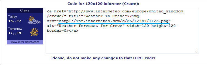

From the received link, for example:
Example of forming the link to the weather informer in iRidium:

The link structure:
http:// info.weather.yandex.net /moscow/3_white.ru.png
| the protocol of data transfer (HTTP) | |
| the address of the resource – the video source | |
| the link to the informer image |
Refresh: 1000...n (ms) – shows the frequency of connection to the informer source (i.e. frequency of updating snap shots in the project, do not indicate less than 1000 ms)
The Test In Browser property is used to check the ready link.
To assign the link to the graphic item which will display the informer drag the dynamic image to the project workspace, on the item. The size of the item has to be the same size as the informer to display the image correctly.
After that you can start editing the link by double-clicking on the item it is assigned to.
URL-schemes: Hyperlinks, Commands to OS
URL-scheme is an indicator to the resource which you need to activate with the iRidium command.
You can perform standard commands of the OS: launch an application, open a link in the browser, open a mail-agent, make calls, send SMS and etc.
There are different types of commands for different OS. Consider the type of the OS the project will work when selecting the commands.
Examples of URL-schemes:
- Execute(http://iridiummobile.net)
- – open the link in the browser (iOS/Windows/Android/OS X)
- Execute(c:\Program Files\iRidium mobile2\iRidium\iRidium.exe)
- – launch the application (Windows)
- Execute(tel:+123456789)
- – call the number (iPhone, Android)
- Execute(sms:+123456789)
- – send an SMS to the phone number (iPhone, Android)
- Execute(mailto:test@example.com)
- – send a message to the email address (iOS/Windows/Android/OS X)
Start iRidium from third-party apps or browsers
- iridium:// - to start and open i2 Control V2.2. The command works in the browser of iOS/Android devices with installed i2 Control V2.2, in application with support of URL-schemes activation on iOS/Android
- iridium://webupdate?https://s3.amazonaws.com/irmarketing/iPhone5_Metro.irpz - upload the project to i2 Control V2.2
- iridium://webupdate? - the scheme of i2 Control V2.2 activation with the "update the project" command
- https://s3.amazonaws.com/irmarketing/iPhone5_Metro.irpz - the HTTP(s) link to the resource where the project is stored
- iridium://script?data1&data2
- iridium://script? - the scheme of i2 Control V2.2 activation with writing data in the script
- data1&data2 - any data string which will be sent to the script, to the query parameter
- IR.AddListener(IR.EVENT_RECIEVE_SCHEME,0,function(query, source) {}); - the listener which received the sent query string and executes actions corresponding to it. source - the name of the resource which sent the data to the script.
iridium://script?Page1
IR.AddListener(IR.EVENT_RECIEVE_SCHEME,0,function(query, source) {
   if (query == "Page1")   {
      IR.ShowPage("Page 1");
   }
});
Open an external app from iRidium
- Execute(app://)
- URL-scheme for launching applications. <app> - the application name. For example: youtube://
Possibility of launching an application depends on the application itself (if the developer included this function or not).
URL-schemes on iOS and Android are not identical. The application you can launch on iOS might not launch on Android.
>>> List of URL-schemes for iPhone >>>
Call the URL-scheme from iRidium Script:
- IR.Execute("command");
Using URL-schemes in iRidium:
Use the Execute command in iRidium to activate URL-schemes.
Setting up of the activation is performed in the item properties: Object Properties > Programming > Press or Release event

Download:
Example of using URL schemes for Windows, iPhone, iPad >>
Creating Visualization Effects
To make the project more demonstrative and dynamic use the ways for creating animation of pressings on items available in iRidium GUI Editor.
Effects on Pressings
When pressing on an item its state can change for demonstrating another image or animation cycle which confirms the fact of pressing on the item visually. To create effects on pressing use different images for the active and non-active item states:

«Fast Effects»

The tool for creating «fast» animation effects allows you to create an item changing its state at pressing on it. The image of the first (non-active) state is used for it. Add the image in Editor Workspace and press on the «Fast effect» button in Tool Box of GUI Editor. In the properties of the modified state indicate:
- Offset of the image relative to initial position
- Transparency of the new state (item alpha channel)
- Font color and size in the new state

Creating Animation
- 1. To create an animated logo which animation cycle will be presented as long as the iRidium project is running:
- 1.1 Create Multistate Button with states containing animation frames (see Importing Objects to create an animated item in Gallery fast and easy).
- 1.2 Indicate that the animation should be presented in cycles - Repeat: True
- 1.3 Set up the feedback which will provide the cyclic presentation of the animation frames - Feedback: On
- 2. To create an animated item which animation cycle will be presented when receiving a non-zero value (logical unit) from the controlled equipment:
- 2.1 Create Multistate Button with states containing animation frames (see Importing Objects to create an animated item in Gallery fast and easy).
- 2.2 Indicate that the animation should be presented in cycles - Repeat: True
- 2.3 Set up the feedback - Feedback: Blink

- 3. To create an item which animation cycle will be presented when it is pressed on:
- 3.1 Create Multistate Button with states containing animation frames (see Importing Objects to create an animated item in Gallery fast and easy).
- 3.2 Indicate that the animation should be presented in cycles - Repeat: True
- 3.3 Set up the feedback - Feedback: Momentary

Optimization of the Project Graphic Part
Use the tool Delete Unused Files to remove from the project the images which were added in it but are not actually used.
Such images lengthen the time of upload and increase the project size. The frequent reason for appearance of such image is item scaling as the copies of image in the new size are created at that.
Make sure your project doesn’t have unused files before uploading it on your control panels:

Merging iRidium Projects
Use the video-instruction to learn how to merge your project with a ready script module (with its own graphic and driver parts)or any other project fast and easy:
Instruction: Merging Projects