Examples of Controlling Equipment of the KNX Bus
Contents
- 1 (1 bit) Relays, Shutters, Dry Contact, etc.
- 2 (1 bit) Trigger Switch with One Button
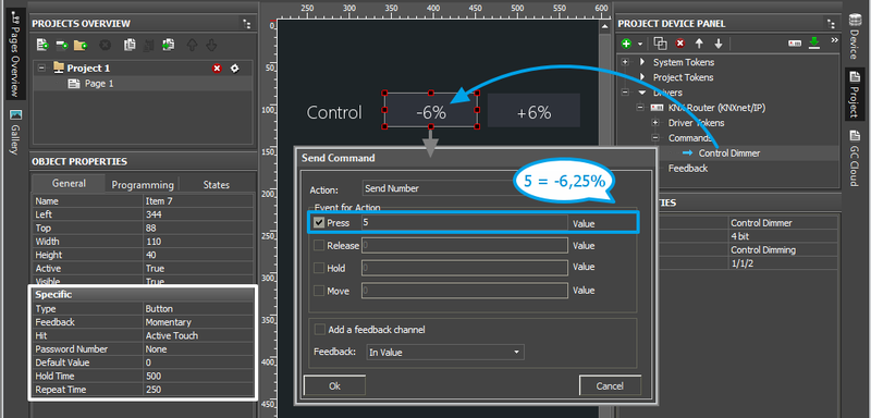
- 3 (4 bit) Increment/Decrement for Lighting and Shutters (Control Dimming/Control Blinds)
- 4 (8, 16, 32 bit) Dimmer, Climate Control and Other Information Variables
- 4.1 (8, 16, 32 bit) Sending Values with Button
- 4.2 (8, 16, 32 bit) Trigger Switch by One Button
- 4.3 (8, 16, 32 bit) Controlling the Level Slider
- 4.4 (8, 16, 32 bit) Increment/Decrement of the Current Address Value
- 4.5 (8, 16, 32 bit) Color Picker - RGB Pallete for Light Control
- 4.6 (Float 16, 32 bit) Displaying Values with Floating Point
- 5 Scenes (Macros) in iRidium Projects for KNX
- 6 Emulation of Project Work
- 7 Launching Projects on Control Panels
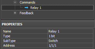
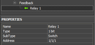
Properties of group addresses in the project device tree:
Setting up of group addresses is made automatically when importing ETS projects in iRidium.
Addresses in iRidium consist of two parts: a command (in the Commands tab of the KNXnet/IP driver) and a feedback channel (in the Feedbacks tab of the KNXnet/IP driver). The command sends values to the KNX bus, the feedback channel receives data about the state of the indicated address:
|
| ||||||||||
|
| ||||||||||
Supported data types:
1 bit, 2 bit, 4 bit, Signed 8 bit, Unsigned 8 bit, Character, 1 Byte, Scene Number, Scene Control, Signed 16 bit, Unsigned 16 bit, Float 16 bit, Signed 32 bit, Unsigned 32 bit, Float 32 bit, ASCII String, Time, Date.
(1 bit) Relays, Shutters, Dry Contact, etc.
This section contains examples of controlling 1 bit group addresses.
Control of 1 bit addresses:
(relays, shutters, dry contact and any other modules which have 1 bit addresses):
- two Buttons – one is for locking the contact, the other one – for unlocking it. You can also set up these buttons for displaying the current state of the address.
- one Trigger Button) – it switches the state of the address to the opposite of the current one (1/0) and displays the current address state.
Displaying the state of 1 bit addresses:
- one Button with 1 state – it displays the address status in the text field of the item as a number
- one Button with 2 states – it displays the address status by changing the current state of the graphic item (State 1 / State 2)
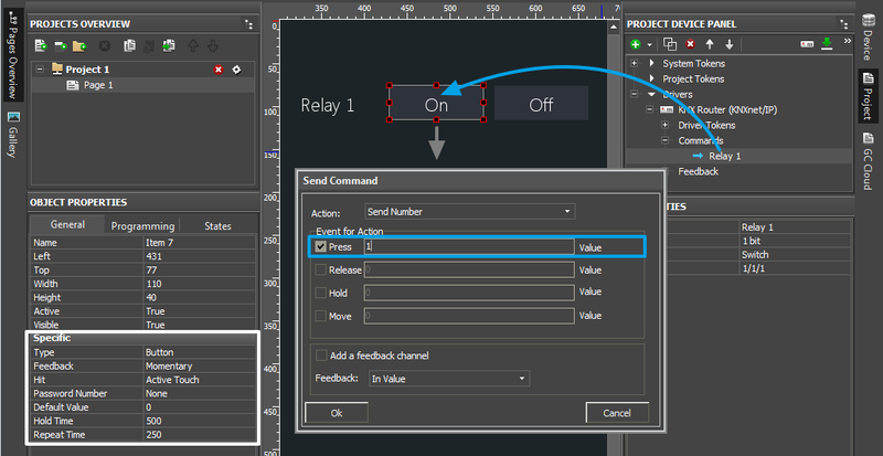
One command in the Project Device Tree panel and two graphic items are required for creation of two Buttons one of which locks the relay in the KNX bus and the other one unlocks the relay. Steps for setting up the Buttons for changing the 1-bit channel state:
(1 bit) On/Off by Separate Buttons
- Create 2 Buttons (settings by default).
- Set up the first button (On):
- Drag the command for the 1 bit group address on the On button.
- In the window for command assigning select the event at which the address state should be changed (Press – when pressing the button, Release – when releasing the button, other events are not used here).
- After you selected the event for command sending, indicate 1 in the Value field (it corresponds to True for 1 bit addresses).
- Press OK to create the command.
- Set up the second button (Off):
- Drag the command for the 1 bit group address on the Off button.
- In the window for command assigning select the event at which the address state should be changed (Press – when pressing the button, Release – when releasing the button, other events are not used here).
- After you selected the event for command sending, indicate 0 in the Value field (it corresponds to False for 1 bit addresses).
- Press OK to create the command.
 If the buttons should flash (change the state) in correspondence to the real address status, then activate the "Add a Feedback Channel [In Value]" field for both buttons when dragging commands on buttons .
After that go to Object Properties, select "Feedback: Channel" for the On button "Feedback: InvertChannel" for the Off button.
(1 bit) Trigger Switch with One Button
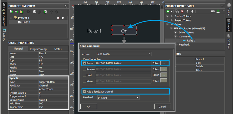
- Create Trigger Button (Trigger Value 1: 0, Trigger Value 2: 1).
- Drag the command for the 1 bit group address on the button.
- In the window for command assigning select the event at which the address state should be changed (Press – when pressing the button, Release – when releasing the button, other events are not used here).
- Mark the "Add a Feedback Channel [In Value]" field for correct work of the button.
If the status of the controlled module is received by another group address (different from the one of the command), do NOT mark the field. And the feedback channel should be assigned separately. - Press OK to create the command.
 If the status of the controlled module comes to the address different from the controlling one, do NOT mark "Add a Feedback Channel [In Value]" when setting up the button. After setting up the command find the status channel which corresponds to the indicated command in the device tree and assign it to the button by selecting the "In Value" tag.
(1 bit) Displaying the Address State
Display with 1 state (Type: Button)
It displays the status as a number. The number is updated in the text field of the graphic item when the address state changes.
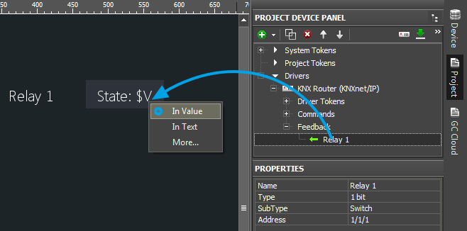
- Create Button (properties by default), delete its State 2 (Object Properties > States).
- In the item text field indicate the template $V. It will enable displaying the address state on the item as a number (1/0). You can add any text before and after the template.
- Drag the feedback channel of the 1 bit group address on the item by selecting "In Value".
Display with 2 states (Type: Button)
It displays the status by changing the button state. The non-active button state - State 1, corresponds to 0 received from the group. The active button state - State 2, corresponds to 1 received from the group. The button state will change when the address state is changing.
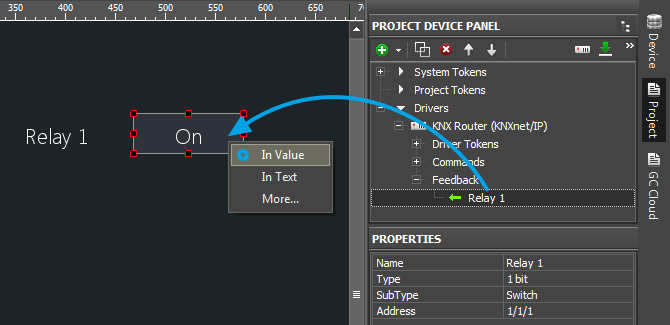
- Create Button (properties by default). It should have 2 states (Object Properties > States > State 1 и State 2).
- Set up displaying of states in correspondence with the address (select the text, icons, color, ...).
- Drag the feedback channel of the 1 bit group address on the item by selecting "In Value".
(1 bit) Controlling Several Addresses (for Shutters, Roller Blinds, etc.)
Control of several 1 bit addresses is made with the help of the same graphic items - Button or Trigger Button, but the addresses are connected with each other and should be set up considering the logics of work for the controlled module. You can see examples for controlling shutters, roller blinds, etc. in different work algorithms of the control device in the KNX bus in the example (Blinds):
Download the example project for KNX
(4 bit) Increment/Decrement for Lighting and Shutters (Control Dimming/Control Blinds)
The address Type: 4 bit is used for controlling LED dimmers and shutters for which it is not possible to set up receipt of the current light brightness (position of shutters).
This address type allows you to increment/decrement the dimmer brightness (the position of shutters) by the preset percent from the maximum value.
4 bits contain 16 possible values: from 0 to 15. Each value corresponds to the particular increment/decrement value. The correspondence is defined by the table:
| CONTROL DIMMING (4 bit) | ||||||||||||||
| 9 | 10 | 11 | 12 | 13 | 14 | 15 | 8/0 | 7 | 6 | 5 | 4 | 3 | 2 | 1 |
| 100% Increase | 50% Increase | 25% Increase | 12,5% Increase | 6,25% Increase | 3,125% Increase | 1,5625% Increase | Stop | 1,5625% Decrease | 3,125% Decrease | 6,25% Decrease | 12,5% Decrease | 25% Decrease | 50% Decrease | 100% Decrease |
| CONTROL BLINDS (4 bit) | ||||||||||||||
| 9 | 10 | 11 | 12 | 13 | 14 | 15 | 8/0 | 7 | 6 | 5 | 4 | 3 | 2 | 1 |
| 100% Up | 50% Up |
25% Up |
12,5% Up | 6,25% Up | 3,125% Up | 1,5625% Up | Stop | 1,5625% Down | 3,125% Down | 6,25% Down | 12,5% Down | 25% Down | 50% Down | 100% Down |
To set up control of the device with the help of the 4 bit group address:
- Create Buttons (properties by default). There can be 1, 2 or a number of those.
- Set up the buttons:
- Drag the command for the 4 bit group address on the item.
- In the window for command assigning select the event at which the address state should be changed (Press – when pressing the button, Release – when releasing the button, other events are not used here).
- For the sending event indicate a number from 0 to 15 in the Value field, based on the table above.
- Repeat your actions for all buttons.
(8, 16, 32 bit) Dimmer, Climate Control and Other Information Variables
This section presents examples of controlling group addresses with the types Signed 8 bit, Unsigned 8 bit, 1 Byte, Scene Number, Scene Control, Signed 16 bit, Unsigned 16 bit, Float 16 bit, Signed 32 bit, Unsigned 32 bit, Float 32 bit.
All these addresses can store a number in the range which is defined by the address Type and Subtype. The subtype defines the available value range more precisely so it should be considered when setting up items.
The available value range of the address affects the settings of the graphic item which will be used to control the address.
Controlling group addresses:
- Button - On/Off, Set Value, etc. – one or several buttons each of which always sends one and the same value (constant). The value is selected when assigning the address to the graphic item.
- Trigger Button) – it switches the two selected address values, for example: 1/0, 0/100, 0/255. The button selects the value opposite to the current one and sends it to the indicated address.
- Level) – it enables sending of a random value in the limits set in the Level settings. The value is changed by the slider: by pressing, releasing and moving the slider. It is required to have feedback from the address.
- Up/Down Button) – it increments/decrements the value by the preset percent from the current one. Indicate the step and limits of increment/decrement in the settings of the Up/Down Button items. It is required to have feedback from the address.
Different ways of control can be combined by creating several items for working with one address.
There are Multistate Buttons and Multistate Levels which work as regular Buttons and Levels but enable setting up of more complex visualization.
Displaying the state of group addresses:
- Button with 1 state – it displays the address status in the text field of the item as a number.
- Button with 2 states – it displays the address status by changing the current state of the graphic item (State 1 / State 2).
- Multistate Level) – it displays the address status by changing the current state of the graphic item (State 1 ... State n). Each item state corresponds to the number received from the bus. Thus you can display a unique image/text/ color for each value (for example, to display one of the possible errors or messages).
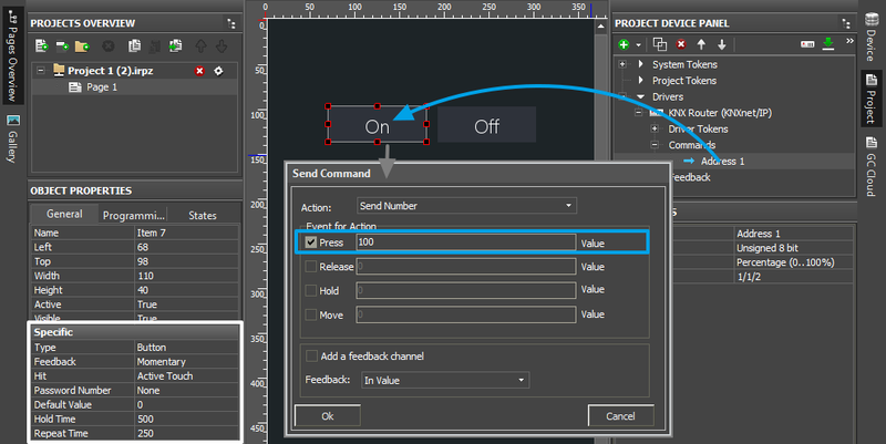
(8, 16, 32 bit) Sending Values with Button
- Create Button (settings by default).
- Drag the command for the group address on the button.
- In the window for command assigning select the event at which the address state should be changed (Press – when pressing the button, Release – when releasing the button, other events are not used here).
- After you selected the event for command sending, indicate a number from the range available for the selected address in the Value field.
You can send whole numbers on any address. Numbers with floating point can be sent to addresses with the types Float 16 bit, Float 32 bit. - Press OK to create the command.
 The button can flash (change the state) when a NON-zero value is received from the address. It is not possible to select the value at which the button changes the state if it is a standard Button item, it has only 0/n (False/True). In order for the button to change the state when receiving "True", activate the "Add a Feedback Channel [In Value]" field in the dialog window for assigning the command.
If it is required to set up the change of the button states when receiving some particular value, then use the instruction for Radio-Buttons (the example is in the end of the article) for project variables (in this case feedback channels of the KNX driver will be used instead of the variables)
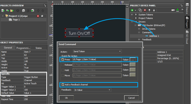
(8, 16, 32 bit) Trigger Switch by One Button
- Create Trigger Button)
- Select "Trigger Value 1" and "Trigger Value 2" – these values will be sent in turns to the group address when pressing the button (for example, 0/1, 0/100, 0/255, ...)
- Drag the command for the group address on the button.
- In the window for command assigning select the event at which the address state should be changed (Press – when pressing the button, Release – when releasing the button, other events are not used here).
- Mark the "Add a Feedback Channel [In Value]" field for correct work of the button.
If the status of the controlled module is received by another group address (different from the one of the command), do NOT mark the field. And the feedback channel should be assigned separately. - Press OK to create the command.
 If the status of the controlled module comes to the address different from the controlling one, do NOT mark "Add a Feedback Channel [In Value]" when setting up the button. After setting up the command find the status channel which corresponds to the indicated command in the device tree and assign it to the button by selecting the "In Value" tag.
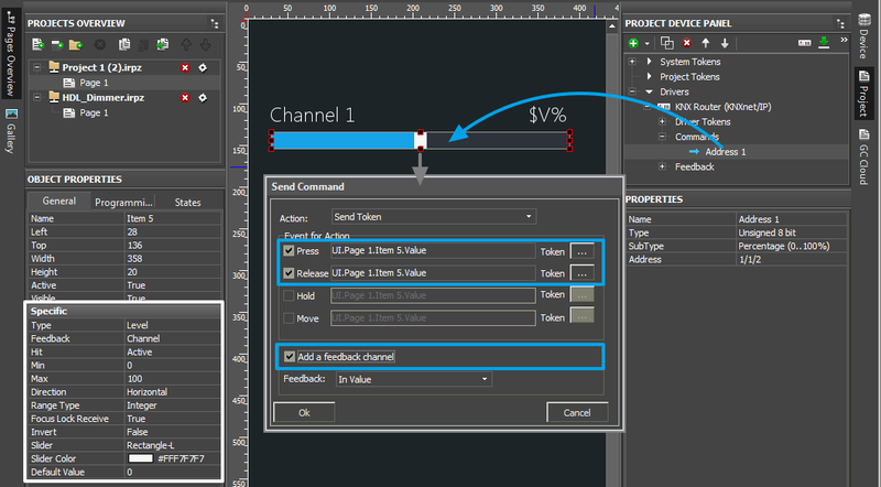
(8, 16, 32 bit) Controlling the Level Slider
- Create Level).
- Select the "Min" and "Max" values – it is the regulation range which defines the limits the Level slider moves in (for example, 0...100, 5...35, -40...50, ...). Make sure the regulation range corresponds to the possible range of the address Level will control.
- Drag the command for the group address on the item.
- In the window for command assigning select the event at which the address state should be changed (Press – when pressing the item, Release – when releasing the item, Move – when moving the slider). To reduce the load on the bus it is recommended to use Press and Release together (not Move).
- Mark the "Add a Feedback Channel [In Value]" field for correct work of Level.
If the status of the controlled module is received by another group address (different from the one of the command), do NOT mark the field. And the feedback channel should be assigned separately. - Press OK to create the command.
 If the status of the controlled module comes to the address different from the controlling one, do NOT mark "Add a Feedback Channel [In Value]" when setting up the button. After setting up the command find the status channel which corresponds to the indicated command in the device tree and assign it to the item by selecting the "In Value" tag.
(8, 16, 32 bit) Increment/Decrement of the Current Address Value
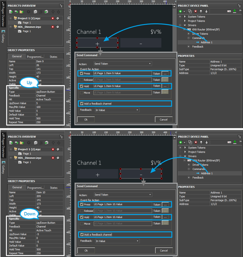
To increment/decrement the current value of brightness and temperature and change the mode of device work, it is convenient to use the special type of graphic items - Up/Down Button.
These items are usually set up in pairs (one Up button and one Down button). Indicate the step (Up/Down Value) and limits (Min/Max Value) of increment/decrement (changes of the variable). Based on the current address state – the feedback channel, this type item defines the next value to be sent and changes the address state.
- Create Up/Down Buttons.
- Set up the buttons:
- "Up/Down Value" – the step of increment/decrement.
For the Up button it is positive (1, 2, 10, ...), for the Down button it is negative (-1, -2, -10, ...). - "Min/Max Value" – the limits of the range which cannot be exceeded.
The maximum value is indicated for the Up button, the minimum value is indicated for the Down button.
For example, at the possible range 0...100, we indicate 100 in Min/Max Value for the Up button and 0 in Min/Max Value for the Down button. Make sure the regulation range corresponds to the possible range for the address which the buttons will control. For Float 16 bit and Float 32 bit you can indicate fractional values (for example, the step of increment/decrement -0.5 / 0.5) - "Hold Value" – it is the same as "Up/Down Value" but it is activated only when holding the graphic item (when the "Hold" event is active). It enables command sending as long as the button is held. It is not an obligatory property, it can be left by default.
If you want to send the command when holding the item, then set up the following:- Hold Time (ms) – the time after which the Hold event will be activated
- Repeat Time (ms) – the frequency of sending the command (how often the command set up for the Hold event will be sent)
- "Up/Down Value" – the step of increment/decrement.
- Drag the command for the group address on the items.
- In the window for command assigning select the event at which the address state should be changed
- Press - when pressing the item, Release - when releasing the button (it is required to indicate at least of one of the events)
- Hold – it should be activated if you indicated "Hold Value" in the button properties. The "Hold" event will automatically repeat the sending of the command as long as you hold the button. If you activated the "Hold" event, make sure you set up the frequency of command sending in the graphic item settings (Hold Time and Repeat Time)
- Mark the "Add a Feedback Channel [In Value]" field for correct work of the buttons.
If the status of the controlled module is received by another group address (different from the one of the command), do NOT mark the field. And the feedback channel should be assigned separately. - Press OK to create the command.
 If the status of the controlled module comes to the address different from the controlling one, do NOT mark "Add a Feedback Channel [In Value]" when setting up the button. After setting up the command find the status channel which corresponds to the indicated command in the device tree and assign it to the item by selecting the "In Value" tag.
(8, 16, 32 bit) Color Picker - RGB Pallete for Light Control
Control of RGB LED lighting (DMX controller) in the KNX bus is performed with the help of special module. It converts a color selected from the palette to commands. The commands set up values in three KNX group addresses corresponding to the preset values of red, blue and green color.
The 4th, white channel of the DMX controller (if there is one) is controlled with the help of Level (not written in script).
You can use any image-palette as Color Picker.
Creating graphic items for controlling RGB by LED strip light:
- 1. Color Picker – the palette for color selection
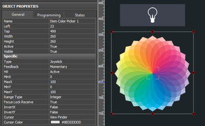
Color Picker – a graphic item with the type "Joystick". In the Image field of the item you should indicate the color palette. The joystick defines the color under the cursor. The color should be separated into the colors of the RGB palette. At that the joystick cursor can be transparent.
It is important to indicate the range from 0 to 100 for Х and Y coordinates. The settings should be as indicated as for an image.
- 2. The item for displaying the color and controlling the brightness
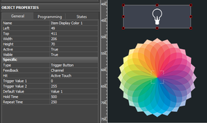
Trigger Button) with two states which will switch the LED strip light on/off and display the color under the Color Picker cursor if the LED strip light is activated.
Forming the list of commands for controlling the LED strip light
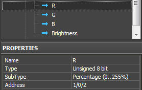
Create 4 group addresses with "Type: Unsigned 8-bit" and "Subtype: Percentage (0-255%)" in the KNX device tree.
The commands should be related to the group addresses regulating the colors of the LED strip light (R, G, B) and its brightness (RGB Brightness).
Adding the script for controlling Color Picker in your project
The script for controlling Color Picker should be copied in the Script Editor window of GUI Editor or import it there as a *.js file.
Open the window for script editing and use one of the methods for script adding: adding from a file or creating a new script.
When creating a new script indicate its name (it should not have numbers only) and add the code for the Color Picker module control:
function work_pick_color(in_color_picker, in_color_resipient, in_sRed, in_sGreen, in_sBlue)
{
   var device = IR.GetDevice("KNX IP Router");                        // KNX Driver in your Project Device Tree
   var color = in_color_picker.PickColor;
   var red = (color  >> 24) & 0xFF;
   var green = (color >> 16) & 0xFF;
   var blue = (color >> 8) & 0xFF;

   in_color_resipient.GetState(1).FillColor = color;

   device.Set(in_sRed, red);
   device.Set(in_sGreen, green);
   device.Set(in_sBlue, blue);
}

// Copy the module to control one more DMX ColourPicker:

IR.AddListener(IR.EVENT_ITEM_RELEASE,
               IR.GetItem("ColorPicker").GetItem("Item Color Picker 1"),        //  Color Picker (Page.Item)
               function()
               {
                  work_pick_color(
                     IR.GetItem("ColorPicker").GetItem("Item Color Picker 1"),  //  Color Picker (Page.Item)
                     IR.GetItem("ColorPicker").GetItem("Item Display Color 1"), //  Display Colour Item (Page.Item)
                     "R",                                                       //  Red Channel
                     "G",                                                       //  Green Channel
                     "B");                                                      //  Blue Channel
               }
               );
Download the file of the KNX Color Picker script
In the script settings (in the lines with the corresponding comments) indicate the following:
- the name of the KNX IP router in the project tree
- Color Picker - the name of the page and RGB pallete item on this page
- Display – the name of the button for displaying the color and controlling the brightness
- Red, Green, Blue - the names of the channels in the KNX project tree where the corresponding colors should be sent.
Assign the command regulating the brightness of the LED strip light to the graphic item – Trigger Button. The command is assigned when selecting the "Press" interface event. Also mark "Add a Feedback Channel [In Value]" in the same dialogue window.
After that the module is fully ready for work.
Download the example of Color Picker (KNX)
(Float 16, 32 bit) Displaying Values with Floating Point
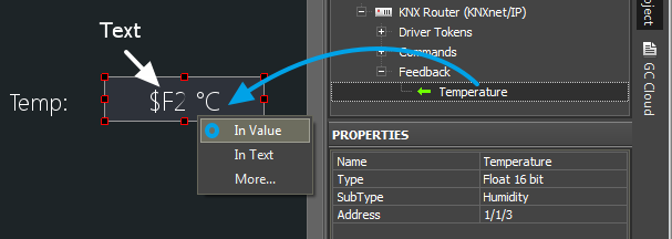
You can write fractional values with the help of any graphic item but when displaying fractional numbers you need to indicate how many characters after the point should be shown. For creating the display item you can use Button with 1 state or any other item.
When setting up the display of Float in the item text field you need to indicate $F1 ... $F5 templates. This item allows you to select the number of symbols after the point you want to display (from 1 to 5).
- Select the item on which you want to output the Float value (special settings are not required).
- Indicate a template in the text field ($F1 will show one character after the point, $F2 – two, etc.) You can add any text before and after the template.
- Drag the feedback channel on the item by selecting "In Value".
Scenes (Macros) in iRidium Projects for KNX
Scenes in iRidium can be created with the help of a standard Button item. Drag several commands for group addresses on it. The order of commands should be the one you want them to be performed in when the item is pressed. If it is required add the delay between commands and additional commands for the graphic part of the project.
Emulation of Project Work
Emulator
- is an iRidium application for Windows which can be launched from GUI Editor for testing your projects. Emulator can work both with a license (with connection to the equipment) and without it (when only the project graphic part is functional).
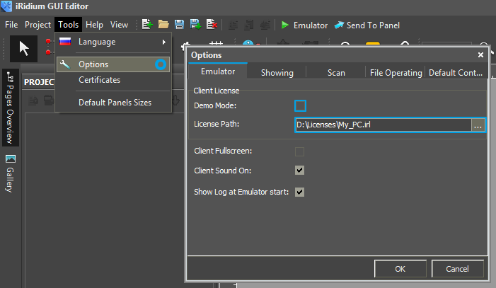
Operation modes for Emulator (see GUI Editor > Tools > Options > Emulator):
- Without the license (Demo Mode: on) – no connection with the controlled equipment.
- With the license (License Path: [...]) – when the license file is selected, all Emulator functions work and there is connection with the controlled equipment.
Indicate the path to the license file for Emulator (GUI Editor > Tools > Options > Emulator):
* When Demo Mode is activated Gui Editor won’t show the message about starting without the connection to the controlled equipment (without a license). Check if there is a license when setting up your project.
Emulator hot keys
- Click F5 to start Emulator.
- Click F8 to open the Emulator settings (password: 2007)
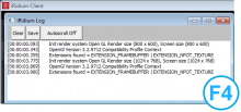
- Click F4 to open the Emulator log.
| For fully functional work of iRidium on your PC it is required to get an iRidium license and activate it for for your PC. Activation of licenses for iPad/iPhone/Mac/Android based or other devices does NOT lead to the automatic licensing of the PC with the installed iRidium Environment. A license for your PC is required for iRidium client on your PC (including Emulator) to work in the fully functional mode. The license should be purchased separately or you can use free For testing purposes you can use free licenses). |
Logging in Windows
iRidium Log is a window where information about iRidium work, error messages and iRidium Script logs (IR.Log) are output in the text format.
To open the iRidium log in Windows, click F4.
Launching Projects on Control Panels
Uploading and launching of iRidium projects on control panels are performed with the help of the iRidium Transfer application installed on your PC. You can also upload your project on the panel from GUI Editor with the help of Transfer.
- Instructions for setting up properties of the iRidium project launch on control panels: Properties for Launching iRidium Projects
- Instructions for uploading iRidium projects on control panels: iRidium Transfer.
- Instructions for setting up iRidium projects on control panel: iRidium App
